

Remember I'm still a newbie Cuttlebug owner, so this faux-letterpress technique is new and cool to me! I'm not sure you're really supposed to end up with that stippled look, but I like how it looks regardless. Besides, distress inks have interesting properties, so maybe you do get a stippled look. I used one of Kim's free digital images, and carefully watercoloured the flowers. (I find my printer ink can sometimes be smeary when watercolouring, but I was able to keep it clean this time.) I added a few leaves behind the flowers to give some contrast against the embossed layer. I love it when products from different companies coordinate: here the tag from Generations, the Divine twine, and the bundled sage distress ink.
Be sure to pop in on Friday -- Operation Julie's Smile blog hop begins, and it's a BIG one!!!
Supplies: cream & black cardstock, Paper Smooches digital stamp, Unity Gratitude=Joy stamp, Victorian velvet & bundled sage distress inks, CuttleBug Happy Birthday embossing folder, Generations tag sticker, Mrs. Grossman's happy birthday sticker, green Divine twine
Pin It Now!
11 comments:
Gorgeous!! I haven't tried that faux-letterpress technique but I really must because it looks so cool. I really like the stippled look - it gives it even more texture. :)
This is gorgeous, Linds! That background sure packs a punch. It even looks embossed the way you've inked it!
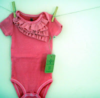
Love that u ignored the baby theme :D Ur card is awesome! Hugs Janna
LOOOVE that color story--great embossing!! And I would never have guessed you were a newbie at the Cuttlebug! LOOOVE:)
great interpretation of the inspiration piece! and I really like the stippled look!!
I have been meaning to try this technique forever, thanks for reminding me...I LOVE the way this turned out and you rocked the challenge by ignoring the onesie ;)
Wow, that is way better-looking than the one and only time I tried faux letterpress. Maybe Distress inks are the key? I think I should try again, because your card is amazing! I love the green pops of color, too.
Wow, I love what you did here. The stippled look is great and matting on the black card really makes it pop. I must try this technique.
This card is soooo pretty! I'm with you on the non-literal approach :) The faux-letterpress looks so good and I like the stippled look, too. The flowers are so graphic, they look great! Oh, and I use a heat gun before I color my digis to keep the smudges to a minimum. Awesome card!
That background is amazing, makes for one fantastic card!
Oh, the stippled look looks totally cool, Linds! Love the perfect placement of the flowers and the coordination of all the sage green!
Post a Comment