Saturday, August 17, 2013

Tying One On?

It's Saturday, and that means it's time for a new Drunken Stampers challenge! When you see the theme of this week's challenge, I'm sure you'll understand why I couldn't quite resist my blog post title...


Keeping with the person, place or thing theme, our "thing" this week is twine! Or if you prefer, string or hemp. I'd imagine jute would sneak in under the challenge guidelines, as well. I went with classic baker's twine:


When I saw this cute Up and Away set by Mama Elephant (animals? balloons?), I knew it would enjoy living at my house. But I have a small confession... I'm not entirely sure what this animal is! Some kind of cuter-than-real-life badger, perhaps? He's the one I wanted to use, so I decided I didn't really care. I stamped him again on a sticky note and cut him out to use as a mask to stamp the balloons. I coloured everything with Twinkling H2Os so there's a subtle shimmer, especially to the balloons. And of course he's floating through the sky! It was one of those rare occasions when a paper and a twine matched perfectly. I also liked how the polka-dot paper echoed the round balloons. 
So break out your twine or twine-like materials, and come join us! 


Supplies: white cardstock, My Mind's Eye Lime Twist Fly a Kite patterned papers, Mama Elephant Up and Away stamps, Versafine onyx black ink, Zing clear embossing powder, Twinkling H2Os, Twinery Caribbean twine, Creative Memories corner-rounding punch, pop-dot tape

Pin It Now!

Thursday, August 15, 2013

Twice the Inspiration at Runway Inspired Challenge

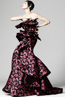
Up till now, I've let Runway Inspired Challenge slip by me. But then when I was browsing for a little inspiration today, I found more than enough in their latest challenge:


Right away, I thought of two things: a particular patterned paper I have, and rich razzleberry ink! And while I adore the swirly look of the dress, that didn't totally work into my plans. I did end up with two different cards, though. 


I've had this silhouette stamp for ages, and finally put ink to it in a way I liked. The little butterflies frame the image and echo the shapes of some of the foliage. A simple sentiment finished the main panel. 


I kept the palette lighter this time, but again went with flowers to go with the floral design of the inspiration dress. I know it's not everyone's favourite, but I do like rich razzleberry! 

Supplies (happy birthday) Stampin' Up rich razzleberry & basic black cardstock, Dear Lizzy Lucky Charm patterned paper, Rosewood Ivy & Flowers, Inkadinkado Nature & Memory Box Happy Birthday stamps, Stampin' Up rich razzleberry ink; (roses) white & Stampin' Up rich razzleberry cardstock, Dear Lizzy Lucky Charm patterned paper, Great Impressions Rose Trio stamp, Stampin' Up rich razzleberry ink, Martha Stewart border punch

Pin It Now!

Wednesday, August 14, 2013

Doing a Double Take at Crafty Creations Challenges

Wednesday! Halfway through another week. Of course that means it's time for a new challenge at Crafty Creations Challenges. This week we are asking you to Make Two: whatever you make, make two of them! While they don't have to be identical, they should have similar designs, images, colours... Here's what I came up with using an image from this week's sponsor, Stamp Fairy:


Same image and sentiment, similar colouring and layout; the differences are in the details. I made this one first:


I coloured Lenny the bear with Prismacolour pencils, die cut and layered him, then added the sentiment. Then I went to work with Glossy Accents, Enamel Accents and Stickles for lots of texture and shine! 
Then I moved on to my second version:


Same image, same size, but this time I used my watercolour pencils just for comparison. (I go back and forth as to which pencils I prefer. :D) I wanted to highlight the cherry on the sundae, so went with this cute patterned paper and some extra cherries as well. I was going to layer the circles the same way as the first card, but they happened to land on my work space this way, and I liked it! I went with stamping the sentiment directly on the card base this time, instead of on a banner. Rock candy distress Stickles on the sundae, cherries, and just a hint on the bear's nose. 
Join us and link up your double creation this week! 


Supplies: white and brown cardstock, Echo Park Little Girl & My Mind's Eye Six by Six Honey Cake patterned papers, Stamp Fairy Lenny Ice Cream & Unity Mix Up of Cuteness stamps, Versafine onyx black, Versamagic red & Hero Arts neon blue inks, Prismacolor & watercolour pencils, spellbinders wonky reverse rectangles & circle dies, Glossy Accents, black Enamel Accents, frosted lace & rock candy distress Stickles, pop-dot tape

Pin It Now!

Friday, August 9, 2013

Inspired Friends with Flair

Happy Friday! It's been ages since I've played along with Unity Friends with Flair. So while I could be out enjoying one of our rare (it certainly seems that way, at least) perfect summer days, I took a little time to make a card that also fits the current Unity {be inspired} challenge. 


I really, truly was inspired by this month's card sketch, and hope I haven't strayed TOO far from the original. 


You can see it, right? Even though the centre panel is much bigger, and the stripes migrated to it instead of the background? And it's horizontal, not vertical? I did have great fun colouring the styling purses EXCEPT that the neon pink ink smudged long after I painted it. Meant I had to trim the image more closely than I'd originally intended. The other two purses shimmer with Twinkling H2Os. I thought the tag shape went with the shopping theme quite nicely. 
I'm entering this in CAS on Sundays "Tag It" challenge, as well. (Thanks, Barb!) ;)
Remember to check out all the other Friday inspiration, and that commenting could just win you some Unity stamps! 

Supplies: white cardstock, Echo Park Be Mine & Life is Good patterned paper & stickers, Unity October 2010 Kit of the Month (Take Time to Laugh), Versafine onyx black & Hero Arts neon pink & green inks, Zing clear embossing powder, Twinkling H2Os, hole punch, Twinery Caribbean twine, pop-dot tape

Pin It Now!

Tuesday, August 6, 2013

Flowery SPARKS

For once, I'm early with a card for a challenge! This week, the Paper Smooches SPARKS challenge is asking us to incorporate sheer or clear elements into a project. I will admit, I thought a smart alecky response would be to say I used all CLEAR stamps to make my card, but figured I could do a little better than that. ;)


Here's what I count as sheer or clear elements: I used all outline stamps, so they're clear inside; the vellum sentiment strip; I think of watercolouring as the sheerest colouring medium; sheer ribbon; and clear rock candy Stickles for the big flower centre. I was pretty excited when I realized I could replicate the bunches of flowers on the patterned paper with my Friendly Flowers stamps! The only other stamp I needed was the little circles (bubbles) from Birthday Buddies. I'm not totally satisfied with the placement of the sentiment banner, and may yet change it. Otherwise I'm happy with this bright cheery card. 
I'm also sneaking this in just under the wire for the Simon Says Stamp Anything Goes challenge. 


Supplies: white & teal cardstock, Echo Park Be Mine lipgloss & Country Drive patterned paper, vellum, Paper Smooches Friendly Flowers & Birthday Buddies stamps, Versafine Onyx black, Memento pear tart, cottage ivy & cantaloupe & Colorbox frost white inks, Wow! white embossing powder, watercolour pencils, Spellbinders oval dies, May Arts ribbon, rock candy distress Stickles, pop-dot tape

Pin It Now!

Saturday, August 3, 2013

My First Drunken Stampers Designated Designer Post!

Good morning, Saturday! It's finally time for my first post as a Designated Designer on the Yellow Canary team for Drunken Stampers. I'm so excited! This term, the Drunken Stampers challenges will feature a person, place or thing. Here is this week's challenge:


I really hope I'm not immediately drummed out of the Drunken Stampers' lounge: I made this card while drinking TEA, plus... there's no stamping! 


Instead of a particular athlete, I chose to focus on tennis as the sport for my card. All the papers are from the Graphic 45 pad "A Proper Gentleman" -- I like that there's quite a proper gentlewoman on the one image. (She might be me! Or maybe not...) I dry-embossed the background panel with what could be an art-nouveau tennis net... well, perhaps if you're a little tipsy. ;) At least I got a teeny bit inky distressing the ends of the torn paper strips. 
Be sure to see how the rest of the Yellow Canary team interpreted this week's challenge! You have till next Friday, August 9th, to link up your own sports-related project. Happy weekend! 


Supplies: Stampin' Up very vanilla cardstock, Graphic 45 A Proper Gentleman patterned paper, Old Paper distress stain, Spellbinders Pebbles Impressabilities, pop-dot tape

Pin It Now!