Pages

Sunday, June 28, 2015

Celebrate

A happy alignment of similarly-themed challenges, a weekend where looking into used ark prices seems not unreasonable, and a desire to play with stamps and inks... and I have a card to share! 
The card:


Many moons ago, I pinned this card, since I had the same stamp set and really liked the way Eva highlighted the shells and anchor using squares. (I'd call them "inchies", but really, they are inch-and-a-halfies.) I sponged the edges of both the squares and the striped paper — the Authentique patterned paper almost calls out for a little distressing, not that I usually hear that call. ;) I was so pleased that I managed to ink the sentiment in two different colours AND stamp it straight! 
The challenges:


The Challenge #40: Nautical
Besides the nautical theme, I was also inspired by the blue and cream of the inspiration photo as well as the stripes. And if I type quickly, I will even get this entered before the challenge deadline. 


CASology #152: Nautical
A second nautical challenge! And almost a day left to enter! While my design isn't the ultimate in clean and simple design, I think it still qualifies. So I hope my CASology friends think so too. ;) 


Shopping Our Stash #207: For the Boys
While I don't think this card is just for boys, I do think it's a very appropriate card for a guy. I may even have one in mind. Also... everything I used is old from my stash.


Crafty Creations Challenges #292: Red, White and/or Blue
Three colours that just happen to be eminently suitable for a nautical card. 


Simon Says Stamp Wednesday Challenge: Anything Goes
Self-explanatory, I hope. :) 


Thanks for stopping by! I think I'll go looking for a rowboat next. 

Supplies: Stampin' Up naturals white cardstock, Authentique Anchored patterned paper, Unity Beach Cottage Collection & Celebrate stamps, Memento Paris dusk & rhubarb stalk; antique linen distress inks, Nellie's Multiframe square die, pop-dot tape

Saturday, June 27, 2015

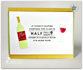
Wine...

... or as we Snarky Sisters like to say, the reason for living. :D That's right, our latest challenge at the Sisterhood of Snarky Stampers: W is for Wine


I may have more than one stamp set featuring the theme. I decided to go with my newest acquisition, called — appropriately enough — Uncorked:


I started with the wine glass, die cut from vellum and stamped on the reverse side. (My ink colour even happens to be called chianti. I could also have used burgundy.) For once, I thought about how I might adhere the vellum ahead of time... I just didn't really have any good ideas. I was hoping a tiny glue dot wouldn't show underneath the ink, and it really doesn't. Neither does the teeny drop of glue at the base of the stem. The wine bottle is also die cut, and I even managed to use two different embossing powders on it at the same time without messing up either! It's adhered with glue dots as well, so it's not completely flat against the layer underneath.  The white panel with its thin borders is popped up on the gold polka dot cardbase.
I'm adding this to the many many other cards at this week's Wednesday Simon Says Stamp challenge: Anything Goes
You know there are going to be great cards from the design team for this challenge, as long as they created first before imbibing. ;) Our newest Queen of Snark and guest designer Vicki has great inspiration for you as well! Hope you'll join us, and in the meantime, cheers! 

Supplies: Neenah solar white cardstock, vellum, My Mind's Eye Lost & Found Rosy patterned paper, Papertrey Ink Uncorked stamps and dies, Versamark, Versafine onyx black, Memento new sprout & Colorbox chianti inks, clear & pale gold pearl embossing powders, pop-dot tape

Tuesday, June 23, 2015

Almost a Card for Two Challenges...

I don't really mean that I made almost a card. Although that may be a concept I will have to think about for the future. ;) I made a card for two challenges, that just happened to be essentially the same... but didn't notice that one ended before the other. Oh well. So I will now say... here is my card for the current Little Tangles challenge, featuring Leslie's sketch


Other than enlarging the three left focal points, I don't think I strayed too far from the sketch. Wait, I may have also cut down the front of the card a bit and added a strip of patterned paper to the inside edge. Possibly after putting my sentiment a bit too close to the tags. 
I used the tag stamp from the set "Gifts for You", since it could be a little bit like a luggage tag, right? I embossed parts of the Origami Map in pale gold before colouring with Twinkling H2Os. Here's a close-up that shows the embossing, the shimmer, and my mediocre watercoloring:


Since watercolouring is my current favourite technique, and heat-embossing my all-time favourite technique, I'm also entering this into the current Simon Says Stamp Wednesday challenge to use a favourite technique or product. 

Supplies: Bazzill marshmallow & Stampin' Up basic black cardstock, Strathmore watercolour paper, Basic Grey Wander patterned paper, Versafine onyx black & Versamark ink, clear & pale gold pearl embossing powder, Twinkling H2Os, ribbon 

Saturday, June 13, 2015

Snarky Sisters Looking for Dudes...

CARDS (or other crafty projects) for Dudes, that is... 


With Father's Day coming up soon, perhaps you're looking for extra incentive to get crafting. Or if like me, you need no dad cards, it never hurts to have an extra guy card or two in the stash. For our previous challenge, I went nautical; this time around I pulled out some Graphic 45 papers: 


If you look at the Graphic 45 blog, you'll find many of their designers will cut specific elements out of the patterned papers to use on their projects, so that was my initial inspiration. Once I had the gentlemen posing with their roadster, it made me think of classic magazine ads, so I tried to duplicate that a bit with my other elements. You'll note a lack of snark, however. I snuck a bit into the inside: 


I like that I was able to use one of the images in a smaller format for the inside. 
Now it's your turn! Be sure to stop by the challenge blog to see the creations of my sisters in snark, as well as this week's guest designer Susan

Supplies: Stampin' Up Kraft, old olive & naturals white cardstock, Graphic 45 A Proper Gentleman patterned paper, Hero Arts Large Plaid Pattern & Unity Consider Yourself Vintage stamps, Versamark & Stampin' Up old olive inks, Zing clear embossing powder, My Favourite Things Layered Label die

Friday, June 12, 2015

Summer Coffee Lovers Blog Hop!


It's the final day of the Summer Coffee Lovers Blog Hop! Hundreds of crafters are participating, and there are several amazing prizes on offer from a variety of Super Sponsors: 


Yes, I'm sneaking in as a bit of a last-minute entry. Yes, I'm being contrary and linking a tea card. But I got some new stamps in the mail yesterday, and one of them kickstarted my blog hop mojo. ;) 


What better than an al fresco Mad Hatters tea party for a summer-themed hop? I kept the colouring of my image minimal in the spirit of the original illustration. I picked a sentiment that has a subtle allusion to the story, as well. (Did you know you can read or download Alice's Adventures in Wonderland for free here?) 
So of course, not only am I late participating in this hop, I'm also behind on commenting on the amazing creations everyone else has linked up! Seems like a good way to spend a rainy Friday afternoon. Enjoy your weekend, and hope you'll stop by tomorrow for the latest Sisterhood of Snarky Sisters challenge! 

Supplies: Bazzill marshmallow cardstock, Strathmore mixed media paper, My Mind's Eye Six by Six Honey Cake patterned paper, STAMPlorations Alice in Wonderland #10 & Viva Las VegaStamps Take Time for Tea stamps, Versafine onyx black ink, Zing clear embossing powder, distress markers, Spellbinders circle & Simon Says Stamp postage stamp edge dies, pop-dot tape

Saturday, June 6, 2015

Pretty Pink Posh: Watercolour Blog Hop!

Paulina is hosting a blog hop on her site Pretty Pink Posh and it's all about watercolour! 


This is a huge hop and the only real requirement? There needs to be some kind of watercolour element on your project. The inspiration is amazing! So many gorgeous creations. But I'm going to link up anyway. ;) 
I recently bought a beautiful necklace from a local jewellery designer to give as a gift. It has a starfish, a sand dollar and a small Swarovski pearl as pendants, and I decided to decorate the gift bag to coordinate: 


I thought the "ink smooshing" technique would be perfect for adding a shoreline/ocean feel to the background. Using three different shades of blue distress ink, I tapped one at a time onto an acrylic block, misted with water, then smooshed it on my watercolour panel. Then for a little more, um, splotchiness, I sprinkled the damp paper with coarse salt. Then waited (and waited) for it to dry. Since I was going all artsy anyway, I got a couple of sprays out and flicked some blue (sparkly) and gold (matte) onto the white areas of the panel. That had to dry, too. Finally I was able to gold emboss my three images over the blue. I really like how they turned out! Here's a close-up of the embossed goodness and watercoloury background: 


If you've been playing with watercolours lately, too, you have the rest of the weekend to link up! I'm off to admire more of the entries. ;) 

Supplies: white gift bag, Stampin' Up basic black cardstock, Fluid hot press watercolour paper, Unity/Iron Orchid Beach Cottage Collection stamps, Versamark & tumbled glass, salty ocean & mermaid lagoon distress inks, pirate's gold embossing powder, Sea Kiss Smooch Spritz, Timeless Art Anthology Colorations spray

Monday, June 1, 2015

STAMPlorations Guest!

For my Naughty or Nice Challenges post,
please click here.


I'm back with a second post on this fine Monday -- I was thrilled to get a shoutout recently from STAMPlorations for this card I submitted for Sketch Challenge #33. It means I am guest designing today with their newest sketch! 


Shery generously sent me a Boxed Rose digital stamp to work with for this challenge. So while I realize that the heart, flower and star are sketch shorthand for "use three different things", I wanted to showcase the rose and used it for all three.


I also took the roses out of their boxes by fussy cutting them from patterned paper, with the yellow one trimmed to a rosebud. The die cut leaves have been around here so long I have no idea who made the die. The white panels are embossed with a woodgrain pattern. It's a simple enough switch-around, but I like how the white looks on a coloured base rather than the usual other way around. I embossed the simple sentiment to finish the card. (By the way, the pink rose is not really quite that neon. Card photography is an ever-evolving skill, for me at least...)
This also gives me one more card for the current Simon Says Stamp Anything Goes challenge
I hope you'll consider giving this versatile sketch a try! Thanks again to STAMPlorations for letting me play along this month. 

Supplies: white and green cardstock, Echo Park Country Drive patterned paper (plus assorted scraps), STAMPlorations boxed rose digital stamp, Paper Smooches thanks stamp, Versafine onyx black ink, Zing clear embossing powder, Papertrey Ink woodgrain texture plate, unknown leaf die

Naughty or Nice... It Can Be Sketchy


It's Naughty or Nice sketch time! I like this sketch: basic enough that it's easy to work with, but with a little flair to it, too. Of course, since we call ourselves troublemakers, I had to mess with it a bit... 


... but otherwise, it's not naughty at all. As soon as I saw the sketch, I thought of the grad card I wanted to make using this cute set from WPlus9. Although I have the dies as well, I wanted to mask the elements (mortarboard, cat and books) together so I could watercolour them. Shockingly, I got the masking right the first time! All cats are grey at the moment, because of this guy. Here's a close-up that also shows the embossed tassel a little better:


Wanting to use that particular sentiment, I had to switch from a long thin banner to an oval. Taking the oval off-centre was all me. ;) There are a few speckles from the embossing powder that I have regretfully decided I can live with (at least for now; I don't have to give this card away for a few weeks). I just don't have the level of hand steadiness required to brush off individual stray embossing powder atoms between letters. 
And because, after all, someone has to win, I'm entering this in the current Simon Says Stamp Anything Goes challenge.
We'd love to see what you would do with this sketch, whether it's naughty or nice! And I'll be back in a few hours with a special guest designing post (eek!). 

Supplies: Bazzill marshmallow cardstock, Strathmore watercolour paper, Prima Introspection patterned paper, WPlus9 Smart Kitty stamps, Versamark & Versafine onyx black inks, pirate's gold embossing powder, distress markers, Spellbinders oval die, Pilot gold fine-line marker, pop-dot tape