Pages

Sunday, January 30, 2011

An Easel Card for Two Challenges

I seem to be on a bit of a challenge kick at the moment, and since I had a new stamp set to try out, a challenge or two seemed the way to go.

Easel card -- closed

Easel card -- open
First, I have to admit that I bought the Unity August 2010 Kit of the Month when it came on sale only because it came with a Dickens quotation. The chance to own a Dickens stamp was just too good to pass up! But to justify my purchase, I thought I'd use an image from the set, too. I tried the trees first all in black, but they looked a little stark, so I inked the foliage in Almost Amethyst ink and the trunks in black. Then I didn't like them just floating on the white square, so the ribbon came out. I like how the polka-dots echo the trees.
The colour scheme of my card is for this week's Play Date Cafe Challenge #66, black and white with a splash of lilac/purple. (My kind of colours!) Over at All Things Unity, the challenge (#23) is to create either an easel or tri-fold card. This is my first try at an easel card, but the tutorial at Splitcoast Stampers made it easy. I did have to do a little mental visualization to make sure I got the textured cardstock base facing the right way. ;) I'm not sure I'll be making a lot of easel cards, but it seemed to work well with the stamps I'd picked.
Charles Dickens. Happy sigh.

Supplies: white, black & Stampin' Up textured almost amethyst cardstock, Unity August 2010 Kit of the Month (All You Need) & Bevy of Butterflies, Memento tuxedo black and Stampin' Up almost amethyst inks, scallop border punch, dollar store ribbon

Thursday, January 27, 2011

A Triple Challenge Valentine

You could even say this card is a quadruple challenge card, if the fourth challenge is coming up with a valentine that a six-year-old boy won't find too mushy. ;)


I used the sketch from this week's Get Sketchy Challenge #71. I stamped the penguin from the Stampin' Up set Animal Crackers without the sentiment, so I could incorporate the pun into the popped-up tag that I printed on the computer. His beak and feet are coloured with a Sharpie, and the ice cube is lightly shaded with a Prismacolor pencil. (Too lightly to show up in the pic, alas.) This card also fits the Animal Antics challenge at Simon Says Stamp and fits the into the Valentine's Day Craft Carnival at Craft Critique. Best of all, I have a boy valentine card!

Supplies: white, red & SU kraft cs, Stampin' Up Animal Crackers penguin, Brilliance graphite black ink, Sharpie, Prismacolor pencil, maraschino Twinery twine, pop dot tape

Tuesday, January 25, 2011

Congratulations to Emily!

The talented Emily is this week's featured artist on Splitcoast Stampers. Well deserved and overdue, I'd say! And what a great excuse to take a look at her gallery and CASE (Copy And Share Everything) a card or two!


Before I even picked the inspiration card, I knew I wanted to use kraft cardstock, twine and the flower image from Unity's October 2010 Kit of the Month. Emily uses both kraft cs and twine so well, and in so many ways; and her varied use of the flower image was one of the reasons I picked up the October KOM a few months ago. I played with the three image layout that Emily used, but decided to go with the single image instead. That led to making a square card base rather than the usual A2 size. I also decided to incorporate one of the die cuts that Emily generously sent to me a while back. And that's how this card came to be.
My second card is a more direct CASE of this card:


The layout is exactly the same. I actually ADDED layers, which is very unusual for me. I changed some of the colours, added twine where Emily used a stamp, and added a stamp where Emily used a die cut. Well, and switched out the butterflies for hearts. Valentine's Day is coming, after all. ;)
Looking for some inspiration, or just enjoyment? Check out Emily's gallery or blog!

Supplies (flowers) white, black & SU kraft cardstock, Unity October 2010 Kit of the Month & Bevy of Butterflies, Versamagic Red Magic chalk and Brilliance graphite black inks, Divine Twine red twine, Recollections black half-pearls, dimensionals; (hearts) white & pink cardstock, Studio G heart & frame, Unity Mix-Up of Cuteness sentiment, Memento angel pink & rose bud and Versamagic purple hydrangea inks, pink sorbet & lilac Twinery twine, dimensionals

Saturday, January 22, 2011

Mini Cards!

The current challenge at the All Things Unity blog (ATU22) is to make mini cards, no bigger than 3"x3". What they don't tell you is that making these mini cards can be kind of addicting! With their small size, you can make them as simple or as detailed as you like. My first one is really simple.


Both images are from Unity's October 2010 Kit of the Month. I stamped and cut out the happiness banner, and popped it on the card base, where I'd stamped the small hearts image and added a strip of razzleberry cardstock.
For my second card, I added a little layering and colouring.


The image and sentiment are from the Unity set Mix-Up of Cuteness. I was going to make the kettle stainless steel, but then decided to go for a retro red enamel one. My dream kitchen has always been red and white; in real life, it's green and cream. Funny how that happens. ;)
My third card gets very fancy... for me, anyway.


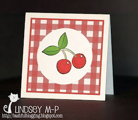
Patterned paper AND multi-media colouring! These cherries are also from Mix-Up of Cuteness. The cherries and leaves are coloured with Sharpies; the stems with Prismacolor pencils.
These were all fun and quick to make! I think there will be more mini-cards in my future.

Supplies: (Hey Hottie) white & yellow cardstock, Unity Mix-Up of Cuteness, Brilliance graphite black ink, Prismacolor pencils; (Happiness) white & SU rich razzleberry cardstock, Unity October 2010 Kit of the Month, Versamagic perfect plumeria ink, pop dot tape; (Cherries) white & SU ruby red cardstock, AmberINK schoolgirl plaid - picnic gingham: tiny iPaper, Unity Mix-Up of Cuteness, Brilliance graphite black ink, Sharpies, Prismacolor pencils

Friday, January 21, 2011

CAS... or PAB? (Unity Friends with Flair, January 21st)

As with any good cult hobby, the world of rubber stamping and card-making has its share of jargon and acronyms. Probably the one closest to my heart is Clean And Simple, or CAS as it's known to those of us on the inside. While I can admire and appreciate detailed, layered, distressed or embellished creations, it's not in my (admittedly tiny) style range. Which brings me to this card.


This, I am afraid, may be less CAS than it is PAB -- a new acronym I've invented! It stands for, of course, Plain And Boring. Two colours of cardstock, one colour of ink, two images, no highly original layout, no embellishments. But I have to admit, I kind of like it anyway.
Check out the Unity blog for the entire list of participants in today's Friends with Flair Hop. You'll find lots of flair!

Supplies: white & blue cardstock, Faded Jeans distress ink, Unity October 2010 KOM Take Time to Laugh

Wednesday, January 19, 2011

Passing the Torch

Yes, it's that time... my month as an AmberINK torchbearer has come to an end. It was a crazy month of balancing holidays, family... and creating! Here's a little summary of what I made, all while running with a flaming ORANGE torch...


And now, drumroll please, as I announce the next ORANGEtorchbearer...


I don't think this is really Meg...
 Meg is a stamper and cardmaker extraordinaire with a wicked sense of humour whom I'm glad to say has become a friend in the past few months. I know she will carry the torch high and dazzle you with her AmberINK creations.
I'd also like to thank the equally über-talented Angela for entrusting the torch to me for the past month. They were big shoes to fill, so I hope I did you proud!  

Monday, January 17, 2011

Almost Ready to Pass the Torch...

This is my last official AmberINK Torchbearer project! Where did the month go? I had such a blast doing this. Amber and Pam are great fun to hang out with, and were very patient with this newby blogger and first time design team member.


For this simple but elegant card, I used the champagne glass from the set Hostess with the Mostess as well as the flourish from Tis the Season to be Pretty, which seems to be my go-to flourish lately! I think the Spin Pin: Holiday - Black Tie: Tiny iPaper is currently my favourite, too. I went with pink champagne, mostly because I couldn't decide what shade I could use for regular champagne that couldn't be mistaken for something else. You know, apple juice. What were YOU thinking I meant? ;) The champagne and the flourish are also traced over with my Spica clear glitter pen that Santa generously put in my stocking this Christmas. (Santa is SO smart.) I had to leave my photo a bit darker than I liked to leave a little of that sparkle showing. (You can see it if you big it, I hope...) I think this will make a perfect engagement, wedding or anniversary card.
Thanks, Amber and Pam, for a fun month! You haven't seen the last of me, though... :P

Supplies: black & white cardstock, silver pearl paper, Spin Pin: Holiday - Black Tie: Tiny iPaper, pink watercolour pencil, Spica clear glitter pen, dimensionals

Sunday, January 16, 2011

Unity Addicts Challenge #34

This week's Unity Addicts Challenge is to use your oldest and newest Unity stamps together on a project.


My first Unity set was Bevy of Butterflies, and my newest is the October 2010 Kit of the Month, Take Time to Laugh. My butterflies have seen lots of ink, but until this card, I'd only used the Christmas-y images from the KOM. This is one of those cards that evolved along the way... I sat with the two sets, tried various colours and combinations, and this is what finally resulted. (It started with blues, a bird and a different sentiment...) I off-stamped the clouds first, to get a softer background colour that seemed to go better with the plum/razzleberry shade -- I always like it when products from different companies turn out to match! Hope you're having a beautiful day!

Supplies: white and SU Rich Razzleberry cs, Brilliance pearlescent orchid & Versamagic perfect plumeria inks, scallop edge punch, corner-rounding punch, pop dot tape

Friday, January 14, 2011

Christmas RAK Flashback

Yes, it's the middle of January... must be a perfect time for a Christmas flashback! Some of my friends also happen to be talented card-makers, and I wanted to share their beautiful creations.


I love how each card is awesome in its own way, each with its own individual style. I do have to say, a cat, a pun on Dickens, and a bit of snark... hard to top that! (Meg also sent me a copy of her Shutterfly Christmas card, with the best picture of her corgi on it!)

Tuesday, January 11, 2011

Who, Me?

The sweet and very talented Emily has generously awarded me with this:


Emily's blog, ArtFromtheHeart, stylish? Check. Mine? Um, not so much. Well, it's a stylish background, I suppose (thank you, Blogger). And the g's in the title? They're quite stylin'. So, I will graciously accept. ;)
In accepting this honour, I have to share eight things about me. Hmmmm...
  1. I am extremely left-handed. (Yes, handedness comes in degrees.) The only thing I do with that other hand is wield scissors, which, come to think of it, may help explain why my fine cutting skills occasionally leave something to be desired.
  2. Favourite author: Charles Dickens.
  3. Cary Grant = swoon. Has since the first time I saw To Catch a Thief when I was maybe seven.
  4. Favourite musical: Sweeney Todd. Stephen Sondheim is a genius wordsmith.
  5. Favourite movie: Holiday. See #3 above.
  6. Book I'm currently reading: Beautiful Lie the Dead by Barbara Fradkin.
  7. Favourite colour: red.
  8. I'm not fond of having my picture taken. (What, you guessed that from my avatar?)
I also have to pass this award on to eight deserving bloggers. This is tricky; I'm so new at this blogging business, most of my recipients will likely go, "What? Who?" And I'm sure some will have received this same award before. But award it I will! (In no particular order...)
  1. Angela @ Paper Cupboard
  2. Meg @ Corgi Creations
  3. Donelda @ Wiggy's World
  4. Julie Ranae @ Julie's Open Window
  5. Cheryl @ CAFE Expressions
  6. Lisa @ Dahlhouse Designs
  7. Michelle @ Freedom in Creating
  8. Heather @ Bits & Pieces
Now I just have to let these stylish people know...

Monday, January 10, 2011

Groovy!

Is this little gift bag not funkalicious?


I used the psychedelic Spin Pin Tiny iPaper and a gift bag template I downloaded over a year ago from The Toymaker website. I did change the handles from rectangular to round, to echo the paper. When I was printing the paper, I played around with some of the print options, and printed the iPaper in a larger size. I won't do that again, as it does not come out quite as crisply as the original, but it did allow me to punch three 1" circles to make a coordinating gift tag. The bag is a perfect size to hold a pair of earrings or other small treat. Totally cool, man. :P
You still have another week to enter AmberINK's INKredible 21 Day Challenge:

Create something to help you get organized, and use at least one AmberINK product. Easy, no? The winner gets to collaborate with Amber herself on a stamp set design... and how groovy is that? ;)  

Supplies: white cardstock, AmberINK Spin Pin Tiny iPaper, gift bag template, EK Success 1" circle punch

Friday, January 7, 2011

Unity Friends with Flair: January 7th, 2011

It's the first Friday of the new year, and that means there's a new Unity Friends with Flair blog Hop!


I used the three cupcakes and a sentiment from the Unity set Mix Up of Cuteness. I coloured the cupcake wrappers and the cherry with Sharpies. I wanted the middle cupcake to be extra special, so I added some paper-pieced brown sugar frosting with sprinkles. The cherry got some clear glitter glue for a little iridescence. This card also fits this week's Unity Addicts challenge to colour in an image.
For more Unity cuteness, check out their new January Kit of the Month:


Enjoy the rest of your Friday hop, and remember to watch for the blinkie! ;)

Supplies: white & blue cs, DCWV Christmas collection dp, Unity Mix Up of Cuteness, Brilliance graphite black and pearlescent orchid onks, clear embossing powder, Sharpies, Studio G clear glitter glue, pop dot tape

Tuesday, January 4, 2011

Play Date Café Challenge #62

As soon as I saw the colours for this week's Play Date Café challenge, I thought of AmberINK's Bunny Bunny Kiss Kiss pink iPaper.


Here's what resulted:


Instead of cutting the bunnies out, I cut a circle out of the iPaper and used it as a frame. After I coloured the bunnies, their tails just needed to be fuzzy!

Supplies: white cs, Bunny Bunny Kiss Kiss iPaper, Love Bunnies Kissy Kiss Fluffy Bottom digital stamp, Prismacolor pencils, baby oil, Studio G white Fun Flocking

Monday, January 3, 2011

Happy New Year!

Happy 2011! I made a couple of different things to help see in the New Year.


I thought these two little fish from Fish Wishes were perfect for a New Year's card. I added the celebrate bubbles from the same set, as well as the little flourishes from Tis the Season to Be Pretty. I love the undersea look of the Dolphin Paisley light blue iPaper with its marine colours and swirling dolphins. And I just happened to have a light blue cardstock that matched perfectly! The little party hats are pieced from gold and silver ribbon (and are much shinier in real life). Finally, I added lots of sparkle with glitter and stickers.


As soon as we set our New Year's Eve table in black and red, I knew I wanted to use Spin Pin: Holiday-Black Tie: Tiny for the dinner menu. It looks so elegant and festive! A perfect way to usher in the New Year.

Supplies: (card) white & blue cardstock, dolphin paisley iPaper, Fish Wishes & Tis the Season stamps, silver & gold ribbon, SU dazzling diamonds glitter, Studio G gold glitter glue, Stampendous silver & gold Dot Sparklers, SU scallop edge punch, dimensionals; (menu) Spin Pin: Holiday-Black Tie: Tiny iPaper